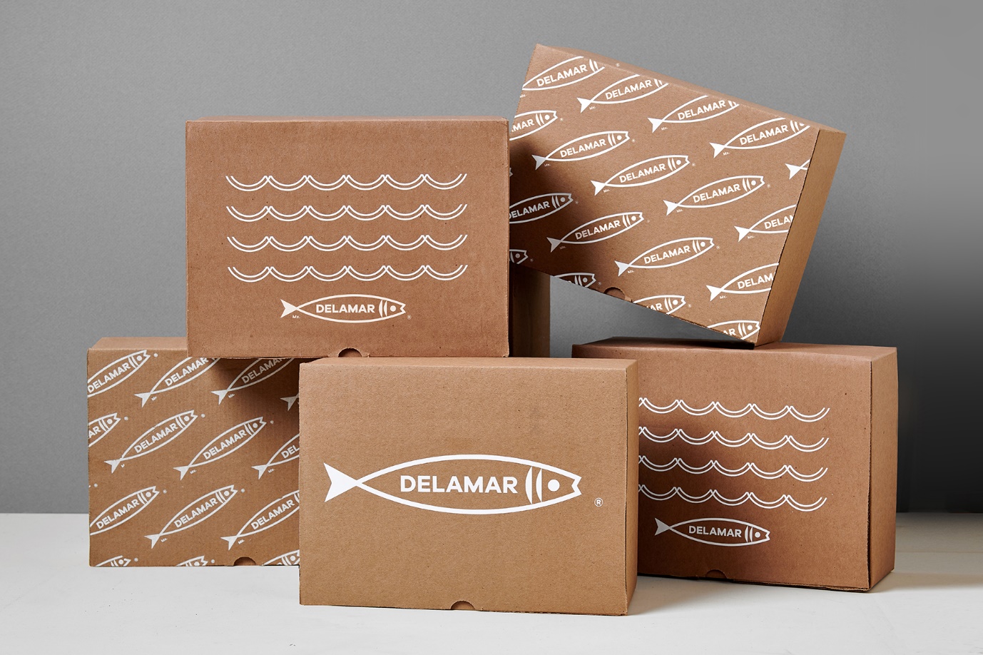
Packaging is one of the most important aspects of branding and it can evoke a sense of trust, quality, and prestige in customers.
It can even increase the perceived value of products or services being offered by a company or brand.
Packaging should be designed with these things in mind as well as other factors that have been identified as being significant for any brand including color, typography, and more!
Why is packaging an important aspect of branding?
Packaging also has the power to make your product stand out on store shelves among all others that are competing for attention. With so many options available, it’s necessary to create packaging that will make your product stand out among them all.
It can help build customer loyalty because you are showing that you care about how they feel when they are using the product. It can also build your company’s reputation when customers are happy with the product they use after buying it.
It allows for brand differentiation, which is important in building customer loyalty. They will stick with you if they know that no one else offers what you do or if your products offer them something that others don’t (unique selling point).
You can make a better first impression with customers. You can improve your product’s perceived value because people may believe that what they are purchasing is much higher in quality when it comes from a company that puts great care into the packaging of their items.
Fun stat: Packaging has been known to add 20% to 30% to the price of a product!
Why is the use of color important in branding?
Colors have been known to influence buying decisions when making purchases. It’s been shown that out of all of the senses, people are most affected by their sense of sight. So it follows that if you want to make an impact with customers, using colors wisely on your packaging can be what does it.
Red, orange, and yellow are the colors that have been shown to increase appetite in people, so they may be great choices for products that are targeted at younger adults, such as cereals or snacks.
Green has been shown to reduce anxiety levels and stress. This means that green is a good choice for health-related products.
It’s been shown that blue can lead people to think abstractly and symbolically, meaning that blues may be a good choice for more luxurious or high-end products where customers will want to know they are purchasing a luxury item.
How should you pick your typography?
You should consider the purpose of your packaging when deciding which font to use.
For example, if you want to create a sense of calm and give your customers the idea that what they’re purchasing is trustworthy, an old-fashioned font may be best. However, if you are branding towards teenagers or young adults, modern fonts might work better because they will relate to the young's better.
When deciding on your font, make sure to choose a font that is easily readable from far away. Usually, the same font used for headlines works best for this purpose because they are meant to catch people’s attention.
You can also create contrast using fonts to attract more attention through the use of different fonts on similar products (i.e. use of a sans-serif font for headlines and a serif font for body text).
How can you determine how effective your packaging is?
A/B testing is the way to test which designs work better. You should test various designs with different groups to understand which packaging options will achieve your desired results. For example, you can test various colors from your color wheel with two different designs to see which one gets a better response that meets your expectations.
What other factors should you take into account when designing?
The size of the packaging in relation to the amount of product is important. If there’s too much empty space inside, customers will wonder about whether or not they are really getting their money’s worth. Too much empty space could also take away from the effect that you are trying to achieve with the use of color, graphics, logos, etc.
You should also make sure that everything is balanced on your product packaging to create a cohesive brand image. Every element of your packaging should work towards achieving your desired effects on customers, such as the use of the right colors, fonts, and graphics.
Your product should be easily identifiable from a distance away by customers, so take care to get your logo out there in a big way! This means putting it on the front or back cover of your products to ensure that they can be seen clearly from far away.
Final Words
Packaging is a vital part of branding that should be designed with the company’s desired effects in mind.
You can use colors, typography, or graphics to create an emotional response from your customers.
The goal is for your packaging to evoke positive emotions such as calmness and trustworthiness so that you may establish a connection with potential buyers.
If you want to test if these strategies are working on consumers, consider A/B testing with different versions of your design while comparing their performance to select the one final option.
Be sure not to forget any important details when designing your product, like its size relative to the amount inside!